onboarding
Addressing investors' motivations
The FCA changed the rules for peer-to-peer lending companies on onboarding investors. The mission was to minimise friction for the newcomers and reduce the impact on existing investors.
“We need to turn this barrier into an advantageous opportunity.”


Assignment
Design, test, build, and launch a range of different flows for different segments of the existing and prospective customer base, by optimising for comprehension and conversion to funding and meeting the regulatory requirements.
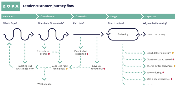
Knowing the investors
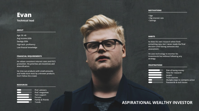
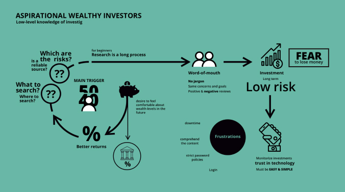
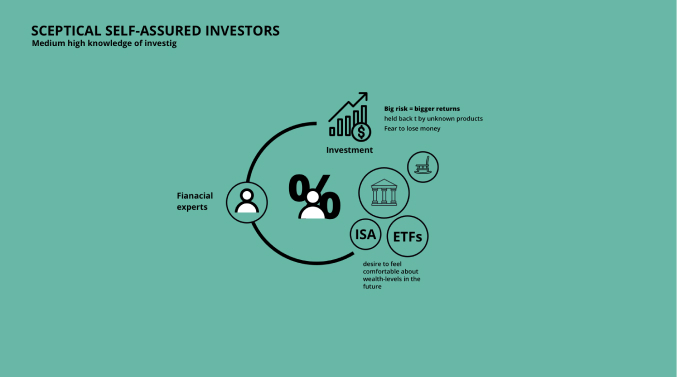
I completed my task by understanding the segment of people who demanded these services. I began with market research, then questioned some peers, mainly from the complaint team, and looked at the data provided by the analysts. Finally, I conducted qualitative research with investors to cluster motivations, habits, pain points, and triggers. We identified two primary personas and the journey across investing money.

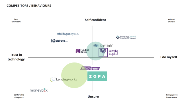
During our evaluation, we looked at how competitors solved the same scenario set out by the FCA, focusing on the benefits and potential drawbacks for the user. We focus the analysis on companies with similar segments and business objectives.
Then we analysed how users interact with us and what they perceive by using the product.
Usability
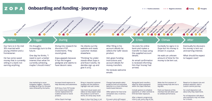
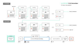
The team had released an initial version that didn't achieve the expected results, so we started reviewing the design to identify usability issues. After refining the journey, we agreed to do a quick test of two options that solve the problem from different perspectives and check which one stands better for customers.
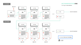
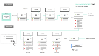
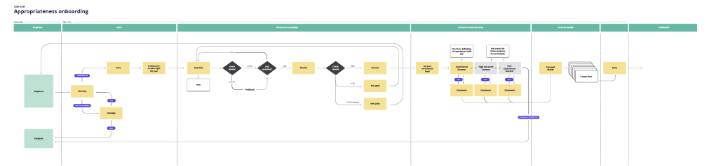
To fix the problem, we consider all the flows leading up to the form to deliver enough value to keep investors engaged. In addition, we allowed customers to customize the experience based on their level of experience.

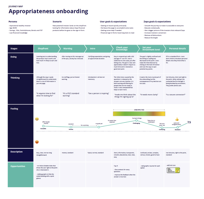
Appropriateness onboarding
Persona
- Aspirational wealthy investor
- Age 30/40
- Savings, ISAs, stocks&shares, bonds and P2P
- Low financial knowledge
User goals and expectations
- Getting on board quickly and easily.
- Not leave the page to accomplish extra tasks.
- Getting some help if needed.
- Financial sign-in forms have long texts to read.
Company goals and expectations
- Smooth the journey to make it accessible to anyone.
- Educate contextually.
- Get a bigger picture of the investor who onboard.
- Increase investors conversion.
- Remove all distractions.
- Reduce the length.
Browser back button (questionary)
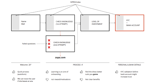
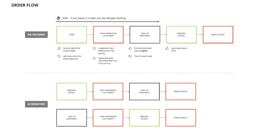
To avoid mistakes during the process caused by trackpad or cheating on results, we have to rethink the back button. We wanted not to take control of a user's browser, as controlling a user's browser causes frustration and concerns about security.

Progress bar + micro interactions
Users should always know what stage they are at on a given journey, especially if it is divided into 3 blocks with many steps each.

Dismissible information
Information is not valuable to everyone in the same way. What's necessary for a few might be a distraction for others, or even misleading.

Pauses and dropouts
Since the form has more than one block of information, we explored different options to allow the user to land on the latest achievement in the event that they left the form during the process or refresh, as well as to protect the data-filled form during long pauses.

Review obsolete icons
Searching for the right visual metaphor for an icon is hard but rewarding, and users benefit from increased familiarity with the product.

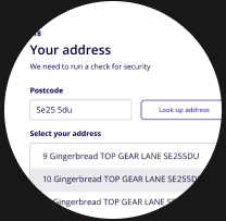
Fill the form and validate data during the process
Reducing the length was one of the main requirements of the company, therefore, keeping an eye on the small details that consume time during the process could give us room where it was most needed.
Nanodoce
the alter ego behind Fernando Magan.
©nanodoce 2024
Please note that most projects are subject to a confidentiality agreement.